I have to say, right now is probably my favourite time to be in the SEO space for all things web. Whilst there is a ton of focus still on providing great content and gaining strong backlinks, SEOs are starting to realise the importance of the technical side of things, and this scratches my tech itch just fine.
With more tech-focused changes on the horizon from Google, such as the Mobile-first index, and web designers wanting to cram more Javascript in their pages, looking for a tool that can handle all your tech if you’re not too tech savvy is probably high on your list. Well look no further. For this first dive into Chrome Dev Tools I’m going to show you three ways I use this tool every day to help with my SEO efforts, with a particular focus on mobile. Plus, there’s gonna be pictures, and we all love some pictures, don’t we? Oh, and it’s free too. Not too bad eh?
Tool 1 - Inspect Element
Inspect Element is the lesser known friend of View Source, and in all honesty, is much more useful to a marketer with or without a technical background. The key advantage being that Inspect Element lets you see the page as Google or a user will see it. That’s right. That means with all your Javascript rendered, and with all the variables that are put in there by Javascript present. If you right click and hit inspect on the menu, or, alternatively hit F12, you’ll see something like this:

This window will appear on the right of your screen by default, but by using the options dots on the top right you can dock this to the left, bottom or even pop the screen out and use it that way.
The main window on the left is the code on your site, nicely rendered, and to the left of that is the CSS that is associated with the highlighted element.
One of the useful things that the Element selector will let you do is enable you to manipulate elements on the page, letting you do some pretty cool things like this:

The above image is the text currently on the page, that can be seen here:

With a little bit of tinkering (double-click on the text and change it) we can get the above text to read:

All it took was a little change after right-clicking and hitting Inspect on the menu. Not too bad huh? And not something that can be done with View Source. It’s a handy technique when you’re trying to decide on the layout of a page, or if certain words would look more appropriate. If you’re worried that you might be messing something up with the current design, don’t worry about it. Just refresh the page and all the changes will be gone.
The element selector can do other things, such as letting us know what CSS Selectors we are using, and this can aid us in scraping, but perhaps I’ll cover that in a later post. For now, this is the cool stuff, and getting to grips with this and being able to navigate your webpage using the element selector is incredibly useful and can even be used to troubleshoot linking issues on your page.
Tool 2 - Mobile Emulation
Now this is where things get interesting. If you’ve ever wondered how you test all your changes on mobile when all you have is a desktop, or how does it look on an iPad? Well look no further, Chrome Dev Tools comes equipped with a host of emulation options to aid in this task.
First of all hit F12 and look for this icon:

Check that there is the Device Toolbar, and once you’ve clicked it, your page will turn into something like this:

Voila! This is the mobile view of a section of the Reflect Digital homepage. Pretty cool. You can change the device at the top of the page:

Pick any of those and the page will change to match the specifics of that device:

And if that doesn’t take your fancy, you can add more options via the Edit function in the drop down at the top of the screen. There’s more than likely a device in there for everyone, but if you STILL can’t find it you can add a Custom device.
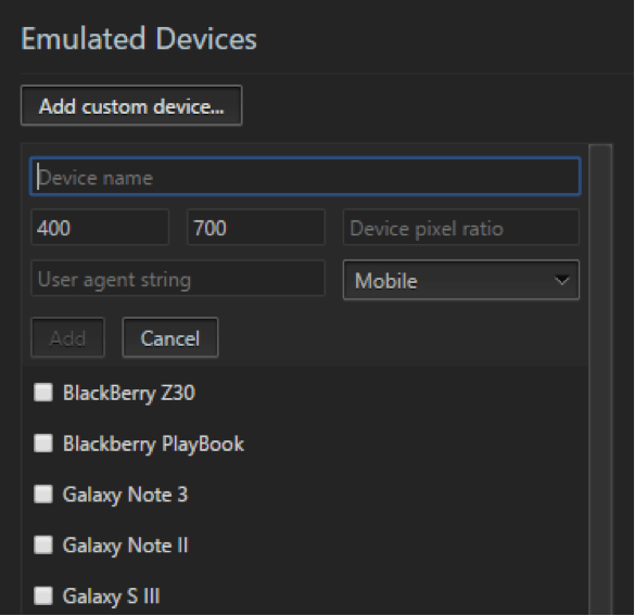
As you can see, you can choose the dimensions of the device, the pixel ratio and even the User Agent (I’ll be covering this in a short while!) that the emulated device will use. A powerful tool if you’re looking for a specific mobile device to test on.
Tool 3 - Network Conditions
Alright, we still have a focus on mobile here as I take you to a related tab. If you hit the settings dots in the top right of your Chrome Dev Tools, go down to More Tools > Network Conditions.

Once you’ve done this, you’ll get yourself a new window:

This window will become your best friend if you’re currently knee-deep in mobile audits and refinement. These two drop-down boxes will enable you to experience your page over a variety of connections, and through a variety of User Agents.
Network throttling
One of the challenges of mobile design is ensuring a page is responsive and quick to load. Now trying to do this is tricky, as a user could have a 2g connection or a Wi-Fi connection, so designing your page full of rich content, videos, high quality images etc may be good for the desktop, but for users on a mobile, will that work out?
The throttling tab has the answer to all those questions:

It will ensure the page runs through whichever speed you select. So, if you’re looking for load times based on a 2G connection, Chrome Dev tools has you covered.
User Agent
The last stop on this guide is the User Agent. The User Agent is the piece of software the acts on behalf of the user. As a marketer or as an SEO, it’s important to know that depending on your browser, websites can behave differently, and to add complexity to this, the mobile version of a User Agent can behave differently to the desktop version. That’s why it’s important to take a look at your page through a variety of User Agents.

This is just a snapshot of the User Agents available in Chrome Dev Tools, however, there are more underneath, and if you’re after using a User Agent not on there (DuckDuckGo has DuckDuckBot) then here is the place to add it.
That’s All for Now...
Unfortunately, that’s all for now, but hopefully I’ve given you enough to sink your teeth into with this quick overview of an often overlooked aspect of Chrome Dev Tools. The ability to emulate mobile devices. This feature is one of the most powerful aspects of Dev Tools, and no matter that device and network you’re optimising for, you’re definitely going to find a configuration that will suit you.
If you find yourself interested in Chrome Dev Tools, watch this space as I’ll be looking to dive into how useful Chrome Dev Tools is when diagnosing Page Speed problems, and how this can be used to identify elements on the page that could be slowing you down.
If you enjoyed this article and learnt something, get to playing around with Dev Tools, and I’m confident you’ll soon find yourself relying on this tool every day for the work you carry out, and discovering how Chrome Dev Tools is the ultimate tool in any SEO or marketer's toolkit.


