
In part one, we looked at what it was that makes storytelling such an effective tool to get information across in a way that engages the listener emotionally. We also took a look at how context can be everything, and simply adding this can create the narrative we are looking for.
In the second part of this data storytelling series, I’ll go more into these structures, as well as the importance of how we tell them, and some tricks to getting to the heart of the insight through stories.
Storytelling with data - what’s the goal?
We can consider that storytelling with data achieves two key things:
#1 Helping us to understand the data.
- What is this data telling me?
- What is the human experience hidden in the numbers?
- What does this tell me about what I need to do now?
#2 Communicating the insights, with impact, to others.
- How do I communicate the insights to others?
- How do I get them excited about what we’ve found?
- How do I get them emotionally invested in the learnings?
As an analyst, I am constantly creating little stories in my head that help drive my efforts forward. It might sound a little like this:
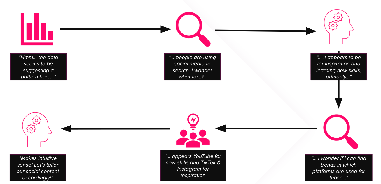
It can be a very effective tool for organising your thoughts, making it possible to pursue avenues of enquiry without feeling overwhelmed or going down too many rabbit holes.
Story structures
As important as the details of a story are, how we structure it is equally important. From an early age, we’re taught that stories have a beginning, middle and an end, and with very few notable exceptions, this remains largely true. There are, however, many ‘variations on a theme’ of this structure. Below are just a few of these.
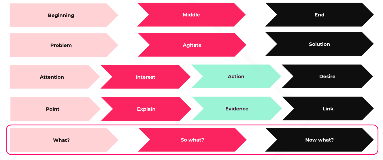
I’ve cheated a little here. Some of these are copywriting tricks that we use to write really compelling messaging, but they’re still storytelling structures, as they organise our message into a sequential order, with each preceding element setting up the next.
An example of this is the ‘Problem, Agitate, Solution’ model (or PAS). This is a copywriting hack described as “The most reliable sales copy formula ever invented” by Dan Kennedy, author and marketing consultant. And for good reason. It creates a narrative in the heads of the reader by introducing a problem they’re experiencing. It then goes on to agitate that problem, making it big, vivid, overwhelming almost. Then the kicker. You introduce the solution, swooping in like a superhero at the last minute.
So you can see, the mechanism is taking the reader on a chronological journey, starting at the problem or the current situation, and ending in the promised land - a place where the problem no longer exists. Evocative, isn’t it?!
Which one do I use for data storytelling though?
Of course, it’s horses for courses, and there isn’t really a one-size-fits-all structure (aside from the overarching ‘beginning, middle and end’), but one we use reliably here at Reflect Digital is the ‘What? So what? Now what?’ model.
In describing the results of an analytics project, we start, as Sherlock Holmes did in the first part of this blog, with the facts.
What has happened? What does the data suggest is going on? What can we learn about our business or our audience? These are all things that basic analytics seeks to answer. “Just describe to me what the data is saying.”
Next, we ask ‘So What?’ This is a crucial step to keeping our thinking on track and creating impact in our audience. If you can’t convincingly argue why the ‘what’ matters to your business, then maybe it doesn’t? Staying aligned to the key indicators of success your business is striving for means less wasted effort chasing the wrong things.
Finally, we reach the crescendo, the ‘end game’ if you will. The ‘NOW what?’ This is the part that delivers the value that the previous two elements promise. What do we do with this information? How can we use it to reach our goals, improve performance, learn even more?
Turning observations into insights
Effectively, what we’ve done is move through the process of observing something in data, attempting to explain it (hopefully with a human-first behavioural lens) and weaponise it to drive the desired business performance.
But something magical happened in the middle there that we can’t just gloss over. It’s something that is often missing in reports, either through a lack of understanding or time. It’s that our observations were, at some point, converted into insights.
I always think of data analysis as exploratory. It’s fact-finding; establishing the lay of the land. Data storytelling, on the other hand, is explanatory. It attempts to make sense of what we can see has happened and make sense of it, explain the mechanisms through which the outcome came about, and crucially, what it tells us about our audience.
Rory Sutherland calls the disproportionate efforts sunk into noting observations at the expense of creating insights as ‘the hyperactive what and the lazy why’? He notes, “The extraordinary effort put into data collection is completely unmatched by corresponding effort looking for interesting causation.”
It’s the reason we often fall short of reaching massive breakthroughs in our strategies. We are satisfied with knowing what happened, but don’t spend the corresponding time to seek deeper reasons for it.
One company that can’t be accused of this is Uber. They recognised that, although customers would report they hate waiting for taxis, simply reducing the waiting time by introducing more cars wasn’t addressing the root of the issue. It’s the uncertainty associated with waiting that makes people feel uncomfortable, so introducing a map, showing exactly where your car is and how long it will take to get to you removes this and makes the wait potentially enjoyable - “It’s stuck at the lights, I’ll order another pint.” quips Rory, with a storytelling flourish.
This kind of thinking moves us away from telling half of a story (the beginning and maybe part of the middle) and actually ends it.
What to do with the numbers
I’ve spoken a lot about the concepts and structures of stories, but what about all of these pretty charts and numbers we started with? Can they help tell a story?
Yes! (with a caveat).
You might remember in part 1, I talked about a previous manager of mine who taught me an important lesson - don’t describe what anyone can see in the chart, add something that the chart doesn’t directly show.
Yes, charts and tables, aggregated top-line figures and so on contribute towards the story, most effectively in the ‘What’ stage. The danger is trying to use them to do a job they were never designed to do. They’re ‘supporting documents’; proof that the insights you’re drawing have a solid, sensible basis.
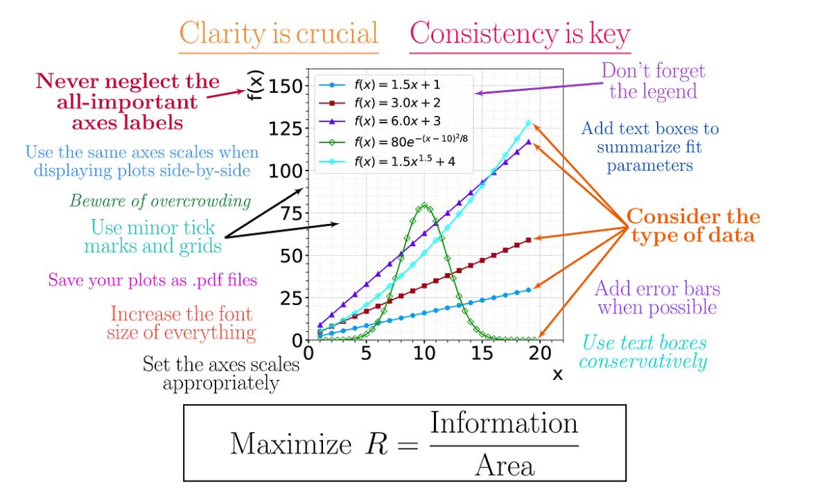
Below is a graphic from Stephen Butalla, that summarises the ‘rules’ to effective data visualisation, and does a better job than I could do in text. Suffice to say, choosing the right plot type for your data is paramount, and having a clear and consistent formatting can make interpretation a breeze for even the most hardened data-phobe.
Key takeaways
I hope these two blogs have given you a taste for the power of stories in data, and get your creative juices flowing as to how to implement them in your next data project.
The key takeaways for part 2:
- Storytelling can help us better understand data while we analyse it, AND increase the impact of those findings for those we communicate them with.
- There are many different storytelling structures, and which one you use is dependent upon what it is you’re trying to achieve. For data, you can’t go far wrong with ‘What? So What? Now What?’
- Getting from observations to insights is the goal of good data analysis. Storytelling is a key to unlock those insights, both for the analyst and the end audience.
- Charts and tables help us to visualise the data, but can’t do all of the heavy lifting to tell the story. They’re necessary but not sufficient.
If you would like to learn more about data storytelling, contact us now, we would love to here from you!


