
In a world overflowing with data, numbers alone rarely inspire action. What makes information resonate is the story we wrap around it, the context that transforms raw facts into something meaningful, memorable and human. This first part of our data storytelling series explores why context matters, how stories shape the way we think, and why telling better stories with data is key to creating real impact.
Why are stories impactful?
Cognitive psychologist Jerome Bruner is often quoted as having said that when facts are presented in the form of a story, people are 22 times more likely to remember them. While this can’t be attributed to any specific piece of research (or Bruner himself), it does raise an interesting point, that does appear to have some evidence in science.
Uri Hasson, a neuroscientist from Princeton University posits that this is because "When you tell a story, you light up different parts of the brain - those associated with emotions, senses, and movement - not just language processing. This makes the experience more engaging and memorable."
What’s more, we all do it, every day!
If you’ve spent any amount of time on Britain’s motorway network, you’ll likely have experienced behaviours such as tailgating, speeding, aggressive undertaking and so on. Our automatic assumption, I would wager, is that the drivers behaving in this way are impatient, self-important and posturing.
What’s interesting is if you make that vehicle an emergency vehicle, the whole story changes. This is because you suddenly have context that was missing. They’re rushing to the hospital or to the scene of an accident. It’s perfectly acceptable behaviour, all of a sudden.
Back to our original driver, what we forget is, it’s perfectly plausible that the driver of the, now civilian, vehicle, could have a pregnant partner in labour with them, or they’re rushing to a hospital, or as simple as being late for a job interview, the success of which could be the difference between losing their house or not.
Every day, we make up stories. We tell ourselves things, and create narratives around events we experience. We don’t often do this consciously; it’s very much an automated process, a cognitive heuristic in order to make sense of a world that’s throwing a bewildering amount of information at you. We also do it because there isn’t enough information, and we need to fill in the blanks.
The example I used above is a cognitive bias we all suffer from; attribution bias, sometimes referred to as the fundamental attribution error. This is the tendency to attribute behaviour to the character of the perpetrator, rather than the situational context in which the behaviour is occurring.
Data without context can be dangerously misleading
Without context, it’s impossible to truly know why the behaviour we’re witnessing is happening at all, yet we are quite happy to fill in those blanks or switch to pre-defined stereotypes and heuristics (“Pfft… typical Audi driver…”).
So, what does this have to do with storytelling and data? Well, it illustrates the importance of context and the context that the story attempts to explain. It’s the difference between understanding these two…
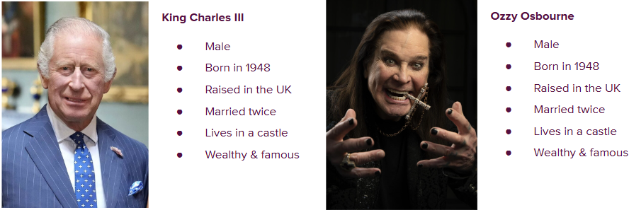
I feel there’s little chance anyone is going to confuse the King of the Commonwealth and the Godfather of British heavy metal, yet that’s exactly what happens when we rely on data without any context behind it. Demographic data is particularly flawed in this way.
As we’ve explored at some length already, adding context is critical to getting our story straight. Now, we need to tell that story, and how we do this can enormously impact how engaged, how well-understood and how memorable our insights are.
Why are stories important?
According to cognitive psychologist Jerome Bruner, when facts are presented in the form of a story, people are 22 times more likely to remember them. This was a part of his larger work on the topic of narrative psychology, in which he explores the idea that there are two forms of thinking; the paradigmatic (classification and categorisation as seen in the scientific process) and narrative, where we organise everyday interpretations in storied form (see our driver example above).
The simplest explanation for this is that stories tap into the emotional parts of our thinking, introducing elements of authenticity, realism and drama. It puts you right in the middle of the action, as if you were watching it on TV.
Don’t just take my word for it though. Here’s what some experts in various disciplines related to storytelling have to say:
“People have forgotten how to tell a story. Stories don’t have a middle or an end anymore. They usually have a beginning that never stops ‘beginning’.” - Steven Spielberg
“The world cannot be understood without numbers. But the world cannot be understood with numbers alone.” - Hans Rosling (Statistician, Author of Factfulness)
“Data is just a point of view. Story is the best way to articulate that point of view and help others to see it.” - Nancy Duarte (Author of DataStory)
So, stories help to add context to data, make it easier to understand and more memorable. Aren’t these all things we want from our analytics projects?
So, let’s now turn our attention to what this actually looks like in practice, using an example from a Path to Conversion analysis project.
Putting it into practice
I remember starting my journey into storytelling through data. It all started in my junior marketing days when a rather perceptive account manager pointed out that all of my report commentary was me regurgitating information that could easily be extracted from the charts and tables. “Use it to tell the story that isn’t immediately apparent,” he said to me (or words to that effect - it was well over 10 years ago now…!).
I’ve just provided you with two examples of how this might look. I started this section with a story. I did the same right at the beginning with our Lewis Hamilton wannabe on the M25. Starting with a story gets the audience engaged from the beginning. You’re reducing the likelihood you’ll lose their attention from there.
Applying this to marketing data can be a bit trickier, though. We can’t know the truth for sure, but what we can do is form hypotheses and build from there, and see if the story makes sense.
Here’s an example from a Path to Conversion project for a travel company. First, just read the text in the pink boxes, which was a real journey through the various touchpoints that resulted in a sale.
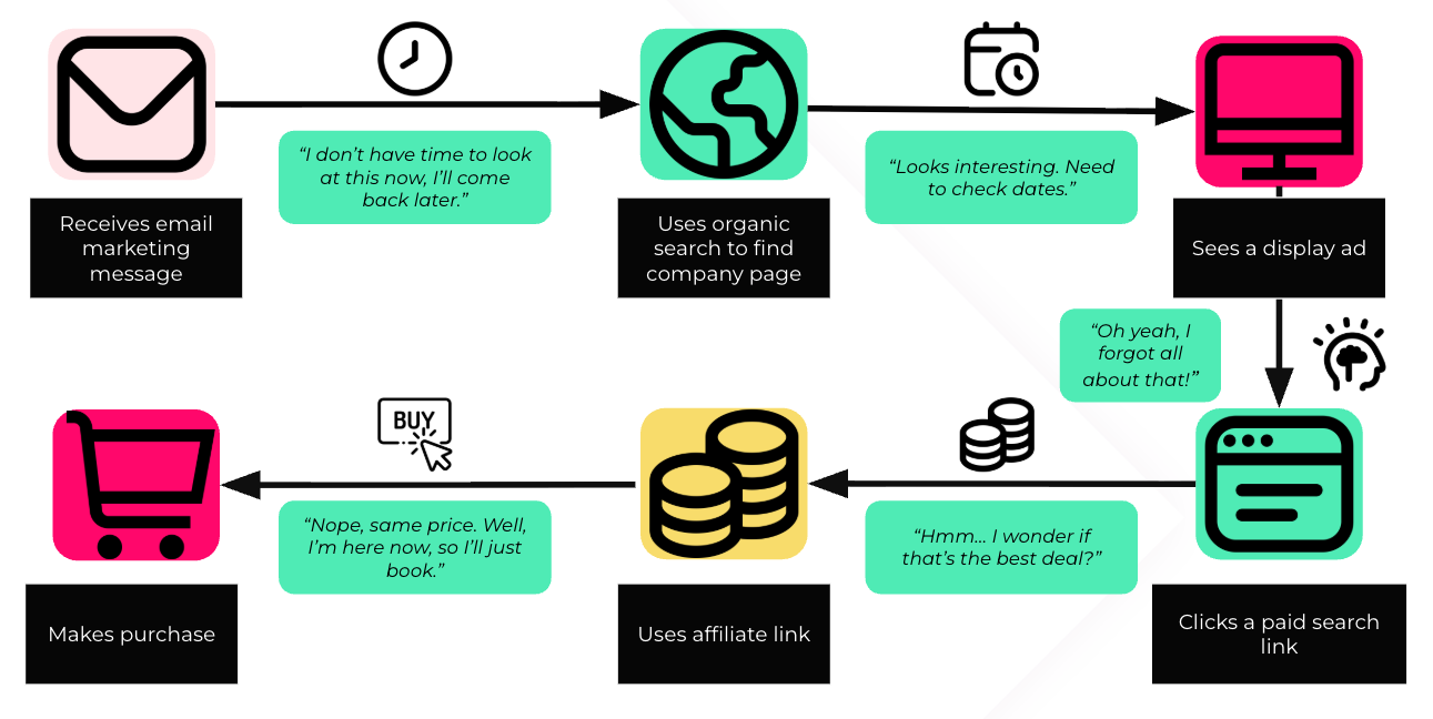
Now read it again, with the green boxes in between. Completely changes the understanding, doesn’t it?
The original question it sought to answer was why so many sales came through affiliate links, rather than directly on the client website. The narrative added allowed us to form a plan to address this, by pointing out that the best prices can be found on the company site.
What it also highlighted was the importance of reminders and retargeting in a travel purchase journey. Due to potential logistical complications of organising multiple parties for a trip, one can’t assume a potential customer can make a snap decision after one or two touchpoints and complete the sale.
Now, I can’t know this is what’s happening for everyone, but it creates a compelling narrative that makes the audience think about the data in a more human-centric manner. 100% accuracy isn’t the aim here, it just needs to make logical sense of the data we have. This makes it far easier to strategise around; if we understand the thinking behind the behaviour, we’re a long way down the road to being able to understand and potentially change it. It can unlock some expected learnings along the way.
Key takeaways
Now, there’s a lot more I could go into when it comes to various storytelling structures, such as PAS, AIDA, Pascalle Bergman’s ‘Storyselling’ and so on, but that’s for another article. Effectively, they all follow a similar structure we all know from books and movies; beginning, middle and end.
For now though, here are the key takeaways:
- Data analysis is exploratory. Data storytelling is explanatory.
- Stories are more memorable and easier to understand than simply regurgitating data.
- Data on its own can be misleading - context is everything and it’s this that the story aims to explain.
- Anyone can do this, and we all do it subconsciously throughout the day anyway. Tap into that imagination!
In the second part of this data storytelling series, I’ll go more into these structures, as well as the importance of how we tell them, and some tricks to getting to the heart of the insight through stories. (Read Part 2 now!)
Contact Us


